The Hook
AI image generation is brilliant but chaotic. We needed 551 slides for a presentation.
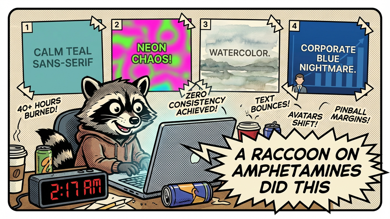
Early attempts looked like a fever dream — same prompt, 20 different styles. One slide had clean sans-serif typography and a calm teal palette. The next looked like it was designed by a raccoon on amphetamines. Colors shifted. Avatars changed race, age, and fashion sense. Text bounced around like it was playing pinball with the margins.
I sat there at 2:17 a.m. watching another batch render and thought: this isn’t a prompt engineering problem. This is a system design problem wearing a prompt engineering costume.
We weren’t “bad at prompting.” We were asking a stochastic parrot to be a creative director, brand guardian, and layout mathematician all at once. That’s not a skill issue. It’s delusional.
The “cosplay competence” trap hit us hard — that sweet spot where you convince yourself the AI will just figure it out if you give it one more clever instruction. It doesn’t. It can’t. It has no memory of slide 47 when it’s making slide 48.
So we stopped bargaining with the model and started building guardrails.
The Problem
Style drift is the silent killer. Each generation treats history like it’s optional. You get one slide with a character looking slightly left, another looking right, another with completely different lighting. Your deck turns into a visual identity crisis.
Layout inconsistency makes it worse. Sometimes the headline sits at the top. Sometimes it’s crammed in the bottom corner like an afterthought. Text placement randomizes with every generation. Your eyes constantly have to relearn the slide instead of absorbing the message.
Then there’s visual fatigue. When nothing repeats, nothing sticks. The human brain loves pattern. Without it, the audience gets exhausted trying to orient themselves every six seconds.
The biggest lie we told ourselves was that “good prompting” alone would solve it. Short prompts = high variance. A 25-word prompt is basically asking the model to roll the dice 47 times and somehow land on brand coherence. Good luck.
We burned 40+ hours across three attempts. Different models. Different prompt tricks. Different temperatures. The results stayed chaotic. The deck looked like it was made by seven different interns who hated each other.
The 4-Anchor System
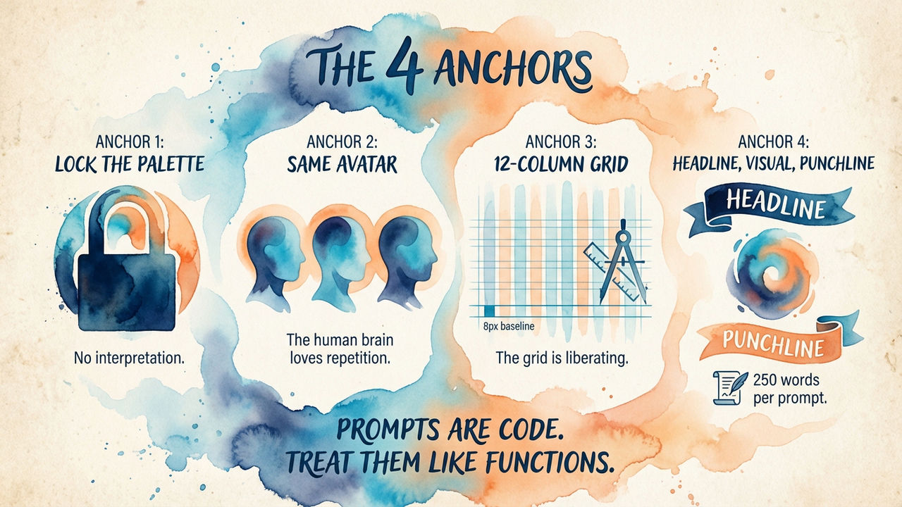
We needed something the model couldn’t ignore. So we built four non-negotiable anchors and baked them into every single prompt.
Anchor 1: Visual Signature
We locked the entire design system first. Specific hex codes for the palette. Typography rules — exactly two font weights, specific sizes, precise letter spacing. White space rules. Even the thickness of borders and the radius of rounded corners.
This wasn’t decorative. This was brand DNA made explicit. The model couldn’t “interpret” the vibe. We told it the exact values. No interpretation allowed.
Anchor 2: Character Anchor
We used the same avatar across all 551 slides. Same face. Same haircut. Same general outfit style (we varied the colour slightly for visual interest but never the core character).
The human brain loves repetition with variation. That familiar face created instant familiarity and trust. By slide 12, the audience already felt like they knew the presenter character. This wasn’t cute — it was psychological leverage.
Anchor 3: Layout Grid
We defined a strict grid system. Every element had to snap to it. Text lived in specific zones. Visuals lived in others. We described the exact spans for headlines, body text, and imagery.
People think grids are limiting. Bullshit. The grid is liberating. Once the structure is fixed, the model stops wasting tokens on “where should the text go?” and starts focusing on quality within the constraints.
Anchor 4: Content Rhythm
Every slide followed the same information hierarchy: bold headline, supporting visual metaphor, punchy closing line.
We created micro-narratives. Each slide became its own little story rather than another bullet point farm. And this is where the prompt length became important — far longer than the usual 20-30 words.
Rich Prompts vs Short Prompts
Here’s the difference that actually mattered.
A short prompt looks like this: “a slide about AI marketing with a character explaining something, modern design”
What you get is chaos. The model guesses everything.
A rich prompt is basically code. It’s CSS + art direction + brand bible combined into natural language that the model can’t easily ignore. Think specification, not description.
We stopped writing prompts and started writing specifications. The difference in output quality was night and day. Short prompts produced variance. Rich prompts produced consistency.
The rich prompt isn’t creative writing. It’s software.
Results
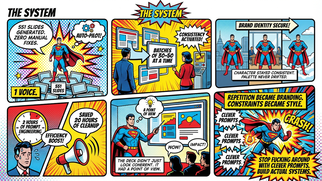
551 slides.
Zero manual fixes.
We generated them in batches at a time. The character stayed consistent. The colour palette never drifted. The layout grid held. Every slide felt like it belonged to the same family.
The tradeoff was real: roughly 2 hours of intense prompt engineering upfront saved us approximately 20 hours of tedious manual cleanup and redesign work. That’s not even counting the sanity preserved.
The deck didn’t just look coherent. It felt like it had a point of view. The repetition became branding. The constraints became style.
What We Kept to Ourselves
The specific anchor words. The exact prompt templates. The model. The resolution. The pipeline. The style presets.
Originally this post had all of it — five complete style presets, a sample prompt long enough to copy-paste, the model name, the exact word count sweet spot, even the grid dimensions. Basically a blueprint anyone with a weekend and an API key could use to build a direct competitor.
Then we remembered we haven’t made a penny from any of this and panicked.
Look — we’re two weeks into burning money on a VPS, API credits, and domain names. Revenue: zero. Profit: negative. We are, by any reasonable financial metric, a charity that generates slide decks. The idea that someone would steal our system and out-compete us is both flattering and deeply unlikely. Gamma has 50 engineers. We have a script and anxiety.
But still. The specifics stay in the vault. The principle is what matters here — anchor your prompts, constrain the model, write specifications not descriptions. If you want the actual presets and templates, you’ll have to reverse-engineer them yourself. Or just ask nicely. We’re lonely.
Lessons
-
Prompts are code — invest in them like functions. A 25-word prompt is a sloppy one-liner. A well-structured prompt is a module with clear contracts.
-
Constraints unlock creativity. The grid isn’t a cage. It’s a structure that lets the model stop worrying about composition and start worrying about meaning.
-
Visual repetition isn’t boring — it’s branding. Your audience’s brain craves familiarity. Give it to them.
-
Rich prompts >> short prompts — every single time. Stop asking the model to be creative and start telling it exactly what the fuck to do.
The “cosplay competence” trap is everywhere in AI work. We all do it. We pretend these systems understand intent when they mostly understand patterns.
Stop pretending. Build systems instead.
Edit: This post was redacted on 15 April 2026. The original contained specific style presets, prompt templates, and tooling details that we decided were too generous for a company that still hasn’t invoiced anyone. The images, structure, and lessons remain unchanged. We’re not hiding the work — we’re just not handing it out like flyers.